

Introduction
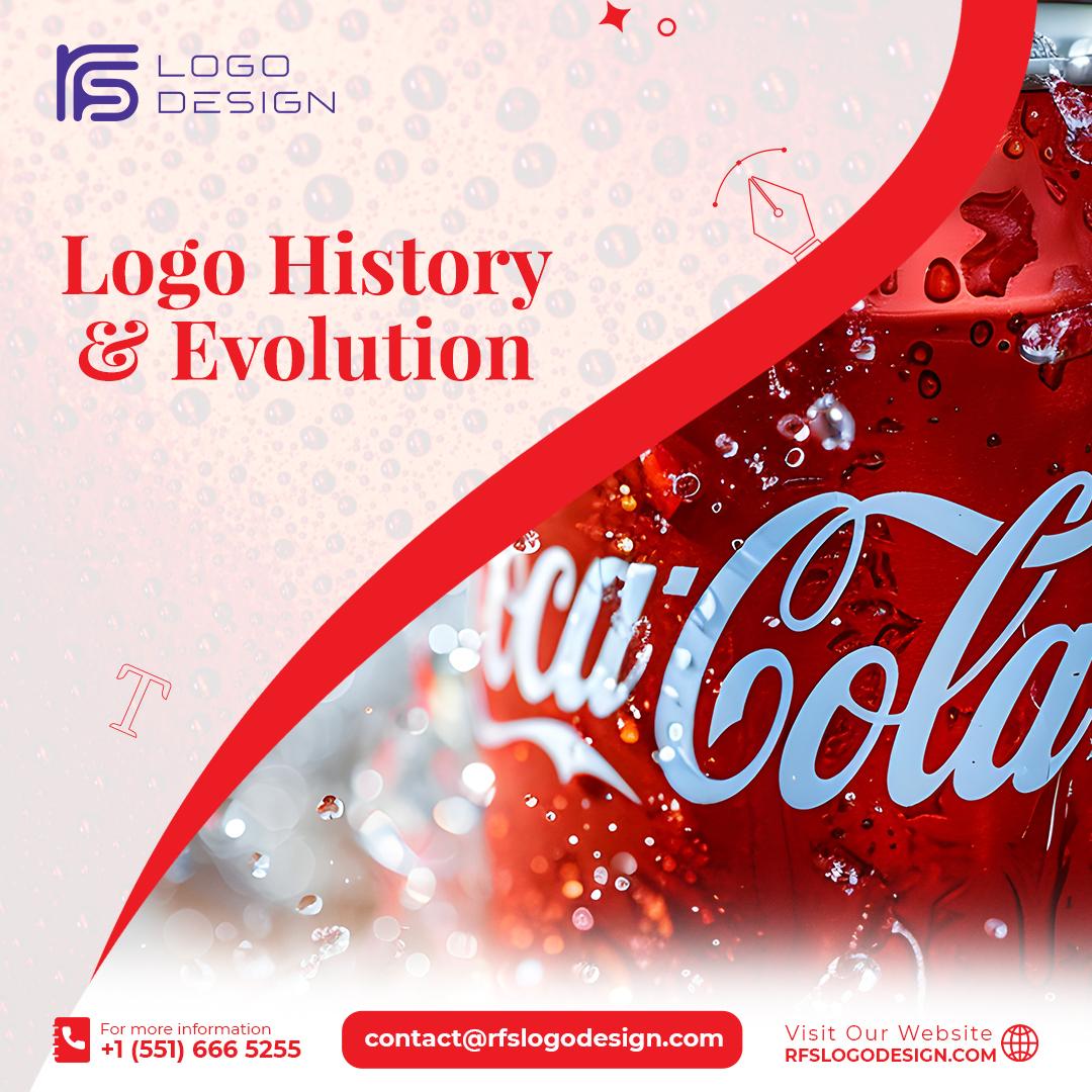
The Coca-Cola logo is one of the most recognized visual identities in the world. Whether it’s splashed across a billboard in Times Square or printed on a vintage bottle in a remote village, the flowing script of Coca-Cola is instantly recognizable. But how did this iconic design come to be, and what makes it so powerful? In this blog, we’ll take a deep dive into the fascinating history, design evolution, and branding brilliance behind the Coca-Cola logo.
A Humble Beginning: The Origins of the Coca-Cola Logo
The story of the Coca-Cola logo begins in the late 19th century. The brand itself was created in 1886 by Dr. John S. Pemberton, a pharmacist in Atlanta, Georgia. But it was Frank M. Robinson, Pemberton’s bookkeeper, who is credited with naming the drink “Coca-Cola” and designing its first logo.
Robinson believed that two “C’s” would look great in advertising. With this idea in mind, he wrote the brand name in Spencerian script — a style of formal handwriting that was popular in the United States during that period. Little did he know, that simple flourish would become the foundation for a global brand identity that would last more than a century.
Evolution Through the Ages
While many brands opt for regular logo updates to reflect contemporary design trends, Coca-Cola has stayed largely consistent with its original script logo. That’s not to say it hasn’t evolved — it certainly has — but the changes have been subtle and respectful of the original design.
In the early years, the logo was often paired with different graphic elements, including decorative borders, slogans, and even images of the beverage itself. However, the core wordmark remained largely untouched. This consistency helped Coca-Cola build a strong and dependable brand image.
In the 1940s, Coca-Cola introduced the red disc — a background circle that emphasized the white script logo. This disc would eventually evolve into various iterations, including the now-famous red ribbon and dynamic swoosh design that often accompanies the brand today.
Perhaps the most significant shift came in the mid-20th century when Coca-Cola began using its red and white color scheme exclusively. These two colors became so strongly associated with the brand that they are now considered inseparable from its identity.
Color Psychology and Brand Identity
Color plays a critical role in how we perceive brands, and Coca-Cola has masterfully harnessed the power of color psychology. The rich red hue used in the logo is often associated with excitement, passion, and energy — qualities that align perfectly with the brand’s message.
White, on the other hand, represents purity and simplicity. When combined with red, it creates a striking contrast that commands attention. This visual combination is not only aesthetically pleasing but also emotionally impactful, reinforcing the brand’s timeless appeal.
Moreover, red is known to stimulate appetite and increase heart rate, which could explain why Coca-Cola’s marketing feels so enticing. It’s no coincidence that many food and beverage brands use red in their branding — but Coca-Cola did it first and arguably did it best.
Typography That Stands the Test of Time
The Spencerian script used in the Coca-Cola logo is more than just decorative handwriting; it’s a statement of elegance and tradition. This ornate style conveys a sense of heritage and craftsmanship, aligning perfectly with the idea that Coca-Cola is not just a drink, but a cherished part of life’s moments.
The choice of script also sets Coca-Cola apart in a world dominated by modern, minimalist sans-serif fonts. In an age where many brands are flattening their logos and simplifying their designs, Coca-Cola’s commitment to its flowing, cursive typeface makes it stand out even more.
It’s interesting to note that the logo manages to be both nostalgic and current. While it evokes memories of the past, it remains relevant and engaging for today’s audiences. That balance is incredibly rare in branding and is one of the key reasons the Coca-Cola logo remains so powerful.
Cultural Significance and Global Reach
The Coca-Cola logo isn’t just a symbol of a beverage — it’s a cultural icon. It has appeared in movies, music, sports, and even political discourse. In many parts of the world, Coca-Cola is one of the first Western brands people are introduced to, making its logo a gateway into global pop culture.
During major holidays, especially Christmas, Coca-Cola’s marketing campaigns featuring the logo alongside images of Santa Claus have become a tradition. In fact, many people credit Coca-Cola with shaping the modern image of Santa as a jolly, red-suited figure — all thanks to clever branding and logo placement.
From Olympic sponsorships to limited-edition regional packaging, the Coca-Cola logo adapts to various cultural contexts without losing its core identity. That versatility is a testament to the logo’s design strength and the brand’s strategic approach.
Minimalism Meets Consistency
What makes the Coca-Cola logo even more remarkable is its simplicity. At its heart, it’s just a wordmark — no mascot, no intricate emblem, no abstract mark. Yet, it has more recognition and emotional pull than many logos that rely on complex design elements.
This is where consistency comes in. Coca-Cola has rarely deviated from its brand standards. Even when launching new products like Diet Coke or Coca-Cola Zero Sugar, the company finds ways to connect them visually to the parent logo. The consistent use of typography, color, and logo placement ensures that all sub-brands remain part of the Coca-Cola family.
The Power of Nostalgia
Another key reason the Coca-Cola logo continues to resonate is its ability to evoke nostalgia. For many people, the logo represents more than a drink — it reminds them of family gatherings, summer vacations, and moments of joy. The logo becomes a visual cue for memories, making it emotionally powerful.
Coca-Cola’s vintage branding campaigns, which often use old logos or packaging styles from decades past, successfully tap into this nostalgia. They prove that you don’t always have to move forward to make progress — sometimes, looking back is just as effective.
The Logo as Art and Inspiration
Artists, designers, and pop culture icons have long been fascinated by the Coca-Cola logo. Andy Warhol famously featured it in his artwork, turning it into a subject of fine art. Street artists, fashion brands, and even musicians have borrowed the logo’s aesthetic to make a statement or create a sense of authenticity.
The logo’s influence extends into design education as well. It is frequently cited in textbooks and design courses as a case study in branding done right. From logo design principles to emotional branding, Coca-Cola offers endless lessons for anyone interested in visual communication.
FAQs About the Coca-Cola Logo
Q1: Who designed the original Coca-Cola logo?
The original Coca-Cola logo was designed by Frank M. Robinson, who was John Pemberton’s bookkeeper. He used the Spencerian script to handwrite the brand name, believing it would look attractive in advertising.
Q2: Has the Coca-Cola logo ever changed significantly?
While the logo has undergone some refinements and additions over the years, the core script design has remained remarkably consistent. This consistency has been a key factor in maintaining brand recognition.
Q3: Why is red the dominant color in the Coca-Cola logo?
Red is associated with energy, excitement, and appetite, making it a powerful choice for a beverage brand. Coca-Cola adopted red to differentiate its product and to make its packaging stand out, especially during the early days of distribution.
Q4: What font is used in the Coca-Cola logo?
The font used is based on Spencerian script, a popular handwriting style from the 19th century. It is not a standard typeface but a custom wordmark created by hand.
Q5: Is the Coca-Cola logo the same around the world?
Yes, the main Coca-Cola logo remains the same globally, though the language around it and certain campaign graphics may vary to reflect local cultures and preferences.
Q6: What makes the Coca-Cola logo so iconic?
The Coca-Cola logo’s timeless script, consistent color usage, emotional connection, and global recognition make it one of the most iconic logos in history.
Final Thoughts
The Coca-Cola logo is more than just a piece of graphic design — it’s a masterclass in branding. Through a perfect blend of consistency, emotional appeal, and design integrity, it has managed to stay relevant for over a century. While many logos fade with time, Coca-Cola’s continues to thrive, standing as a shining example of how simplicity, tradition, and strategic thinking can build an enduring brand legacy.
Whether you're a designer, marketer, or simply a fan of the drink, there’s a lot to learn from the story behind those elegant, looping letters.