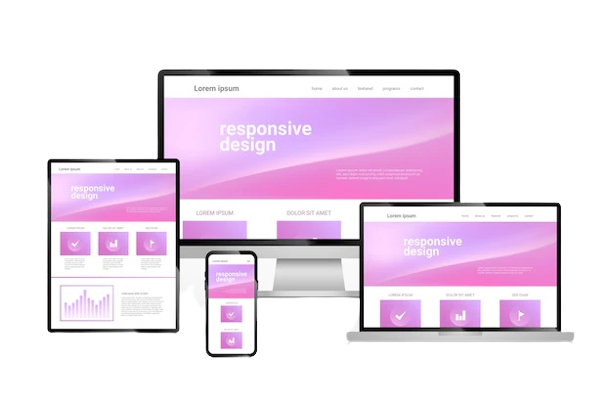
In today’s digital world, users expect websites to work seamlessly across devices—whether it’s a desktop, tablet, or smartphone. Responsive web design ensures your site adapts to different screen sizes, offering a smooth user experience everywhere. However, many businesses still fall into common traps that hurt usability, performance, and SEO. Here are some of the most frequent responsive design mistakes and practical tips to avoid them.
1. Ignoring Mobile-First Design
One of the biggest mistakes is designing for desktop first and shrinking it down for smaller screens. This often leads to cramped layouts, tiny buttons, and slow load times on mobile devices. How to avoid it: Adopt a mobile-first approach by designing for the smallest screen first, then scaling up. This ensures key elements like navigation, text, and calls-to-action remain clear and usable on any device.
2. Overlooking Breakpoints
Breakpoints define how your layout adjusts at specific screen widths. Many designers set too few or inconsistent breakpoints, resulting in awkward gaps or overlapping elements. How to avoid it: Use common breakpoints for phones, tablets, and desktops, but test extensively on actual devices. Flexible grids and fluid layouts help maintain consistency without relying on excessive fixed breakpoints.
3. Not Optimizing Images
High-resolution images look great on desktops but can slow down mobile performance. Large, uncompressed images increase load times and frustrate users. How to avoid it: Use responsive images with the srcset attribute and compress files with tools like TinyPNG or ImageOptim. Consider next-gen formats like WebP for faster loading without losing quality.
4. Poor Navigation Design
Desktop-style navigation doesn’t always translate well to small screens. Complex menus or tiny links make it difficult for mobile users to find what they need. How to avoid it: Implement mobile-friendly navigation, such as hamburger menus or collapsible panels. Ensure links are large enough to tap easily and that critical pages are no more than two taps away.
5. Forgetting Touch-Friendly Elements
Buttons and links that work with a mouse may be too small for fingers. This causes accidental clicks or user frustration. How to avoid it: Make buttons at least 44x44 pixels, add sufficient padding, and leave adequate spacing between interactive elements to prevent mis-taps.
6. Ignoring Page Speed
Responsive sites can still be slow if they include heavy scripts, unoptimized images, or unnecessary plugins. Slow load times drive visitors away and hurt SEO rankings. How to avoid it: Minify CSS and JavaScript, leverage browser caching, and use a content delivery network (CDN) to improve performance across all devices.
7. Skipping Cross-Device Testing
Many designers rely solely on browser resizing to test responsiveness. This misses real-world issues like device-specific bugs or orientation changes. How to avoid it: Test on actual devices—iOS and Android phones, tablets, and various browsers. Tools like BrowserStack or Responsinator can help identify problems before launch.
Final Thoughts
A well-executed responsive design improves user experience, boosts engagement, and supports SEO. By avoiding these common mistakes—such as ignoring mobile-first principles, neglecting image optimization, or failing to test thoroughly—you can create a website that looks and performs flawlessly on every screen. Responsive design isn’t just about fitting content; it’s about delivering a smooth, enjoyable experience for all users.


